Basic Navigation
Main Navigation Window
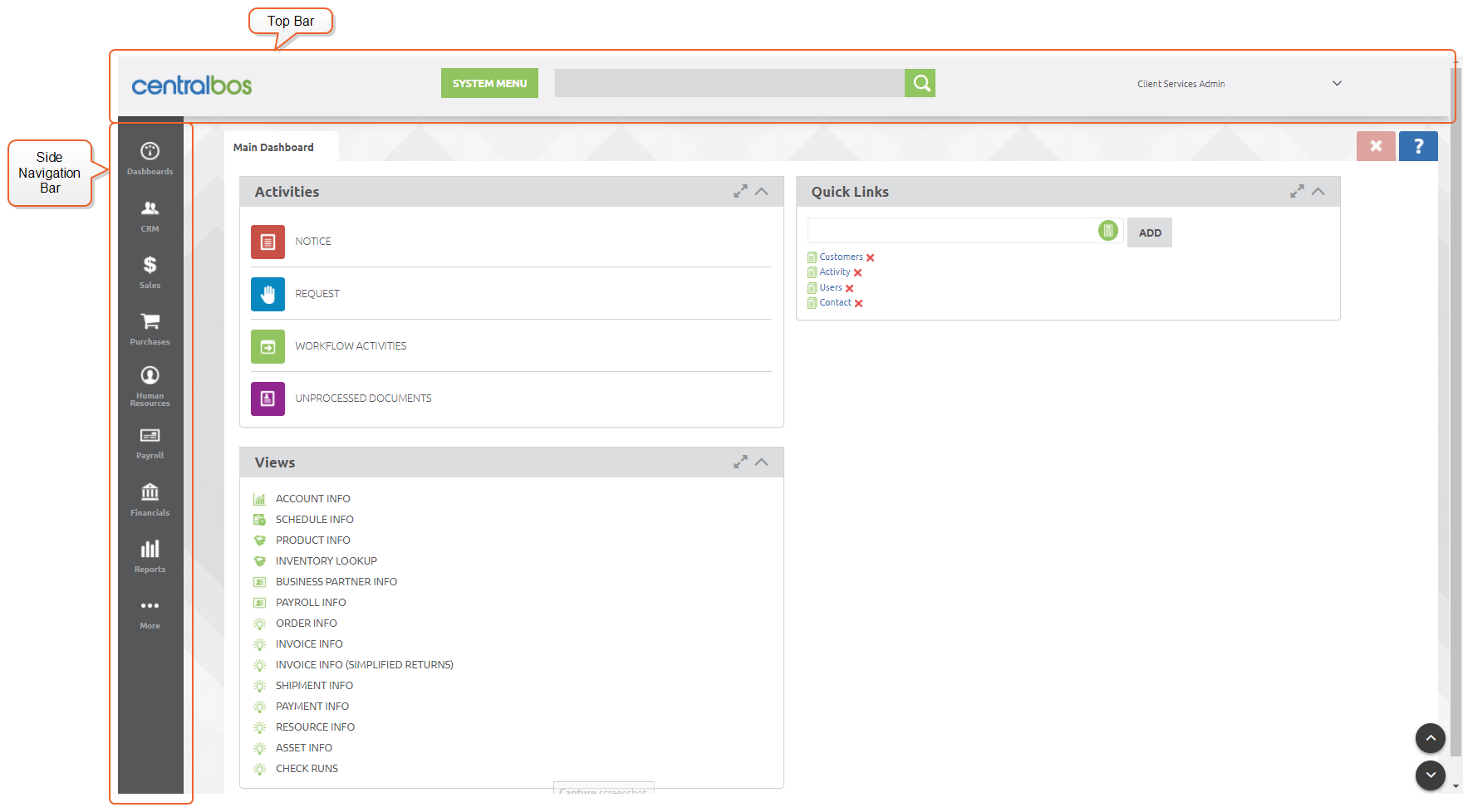
The first thing that you will see after Logging In to the system is the main navigation window. The main window has 3 major sections-- The top bar, side navigation bar, and main dashboard.
Side Navigation Menu
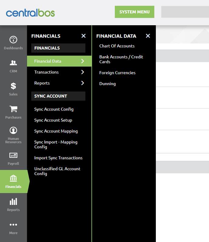
Most of the functions in the CBOS system can be reached from the side nav menu. The root level shows the categories as icons, and function selection is made via cascading options. Each category is also color coded for clarity. The example below shows the Financial Data menu within the Financials category selected, revealing the four options Chart of Accounts, Bank Accounts / Credit Cards, Foreign Currencies and Dunning.
Grid View
Selecting the previous example of the side menu choice (Financials > Financial Data > Bank Accounts / Credit Cards) will show the first of the two common types of display windows: The Grid View.
The grid view is similar to a spreadsheet. Information is displayed in rows of cells, and each column can be sorted in ascending or descending order by clicking on the column header.
In the grid view, each row corresponds to an entity such as a customer, product, or in the example below, a bank account.
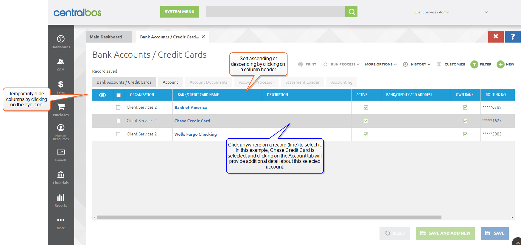
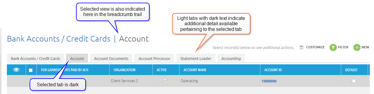
Each grid view has its own set of tabs, specific to the data being viewed. Tabs that are available for a given record are indicated by their color. In the example above, the selected tab, Bank Accounts / Credit Cards, is darkest because it is the tab that is currently selected. The Account tab is lighter in color, but has dark text, denoting that clicking on this tab will provide additional detail about the selected record (Chase Credit Card). The four other tabs are readable, but grayed out, because they indicate the third level of detail, in this case, information about the account.
Selecting the Account tab will make additional tabs selectable:
This implies an additional fact that may not be immediately apparent: Not all of the tabs are at the same level-- some represent data that is part of another tab. One way to think of this is a notebook that has sections, and tabs within a section. However, this is not apparent at first glance. In the example below, the Activity record being displayed refers to the Contact, and the Contact refers to the Customer.
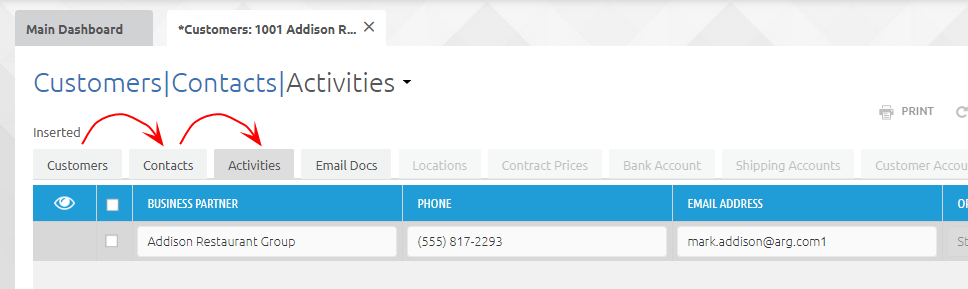
Another term often used to describe this relationship is "parent" and "child" tab. In this terminology, Customers is the parent tab, Contacts is a child of Customers, and Activities is a child of Contacts.
Filtering the Grid View
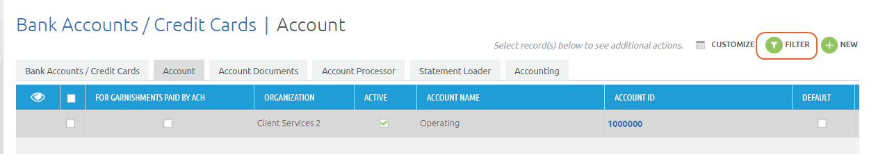
The  icon serves as a way to search for and limit the displayed records in a grid view. In some cases, the filter view may also be the first thing that you see when navigating to a given screen.
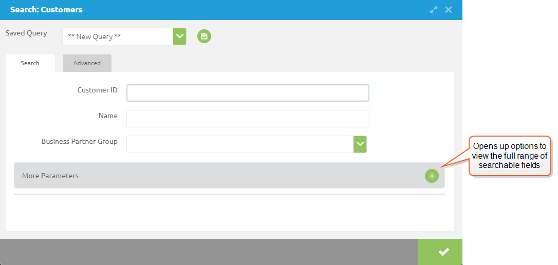
The fields available for search will vary depending on what type of record you are viewing. The example below shows a filter for the Customers grid view. The "Name" field will match any contiguous set of characters. For example, "John M" would return "John Martin" and "John McGowan" but not "John Lewis". Note also that the string does not need to be at the beginning of the data-- entering the character string "McG" would return the name John McGowan.
Not all fields behave in this way, however. Some, such as email addresses, require an exact match (although these can be searched in additional ways using Advanced search). Fields with an icon on the right side will bring up an additional dialog, for instance a calendar icon will bring up a date picking tool. Fields with a down arrow will provide a list of available choices. The example below shows the filter dialog for the Invoices window:
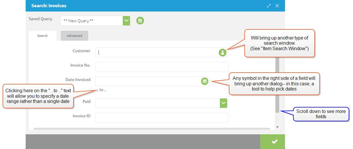
The More Parameters section will provide a list of all of the potential search fields. (If the More Parameters selection is not visible, scroll down to see it.) This section will also provide additional search options, such as date or numerical ranges.
(You will note that the filter dialog also has an Advanced tab. This is used for more complex queries, and is beyond the scope of basic navigation. For more information, see Filter Advanced Tab for Queries.)
Customizing the Grid View
It is possible to customize which columns show up using the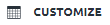 button on the upper right. Clicking this button will bring up a dialog box that allows you to pick which columns will normally be shown.
Columns can also be temporarily hidden by clicking on the eye icon in the first column header.
More Options
If any line in the grid is selected (by clicking on the line), the  button will appear on the upper right, next to the Customize button. Clicking on this button will open a drop-down menu that applies to the grid and/or record that is currently selected.
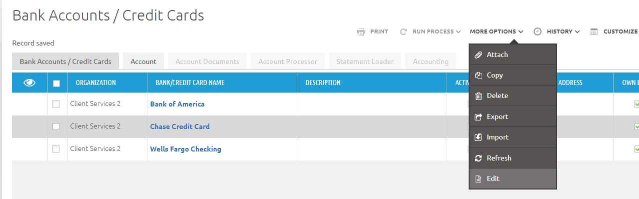
The Attach option will allow you to associate a file with the selected record. Copy and delete also operate on the selected record.
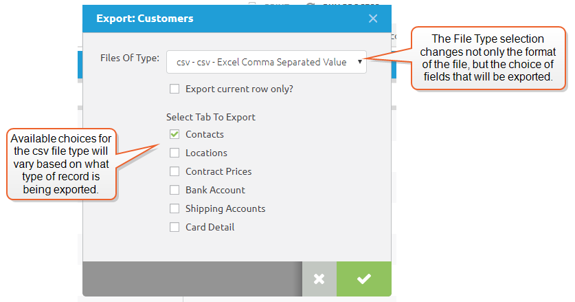
The Export option applies to the full grid. It will generate exports in one of two ways, depending on the file selection used.
- The .xls file type selection will export records in the format currently being viewed. This includes the selected columns and their positions, as well as any filters that have been applied. If no filters have been applied, the export will default to all records, or, if the check boxes are used, to only those items that have been checked.
- The .csv file type selection provides the ability to choose export fields that are within the record type being displayed, even if those fields are not currently visible. (See Edit Window for further explanation.)
The Import option provides the ability to import large amounts of data where manual entry would be too labor-intensive. (For additional information see .)
Edit is one of the most important items to note in this drop-down list. It provides the full detail view of the currently selected record, as described in the next section.
Edit Window
In some cases, edits can be made directly in the grid view, but often it will be useful to open a full window that shows all of the fields for a given record. This full-detail view is referred to as the Edit Window. In some cases, records will open directly in the edit window. In other cases, you can enter it by using the More Options button as described above.
Selecting a bold blue field (similar to a web link) will open the edit window for a given field as well. In the image above, the Bank/Credit Card Name column is an example of this type of field.
The edit window uses the same multi-tab presentation that the grid view does.
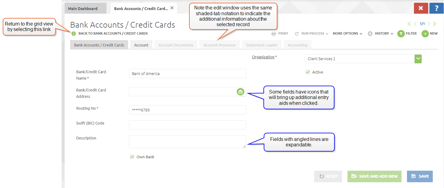
To return to the grid view, use the "Back to..." link on the upper left of the view.
Fields with angled lines in the lower right corner can be expanded in size by dragging that corner. This symbol also denotes that the amount of text entered can exceed the viewable box. In this case, vertical scroll bars will appear to allow you to view and edit the text.
Some fields have icons in them that will bring up input aids or search windows.
System Menu
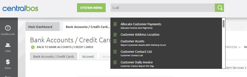
In the top bar of the main window there is a field box labeled System Menu. Any of the functions that can be reached through the side menu can also be reached from here, by typing the first few letters of the function. In the example below, we have typed the four characters "Cust" into the window, and brought up a large number of choices for commands that have the word Customer in them. You can scroll down to see the various options, or add additional characters to narrow the search. In the image below, typing "Customer A" will yield only the two options Customer Address and Customer Assets.
Quick Links
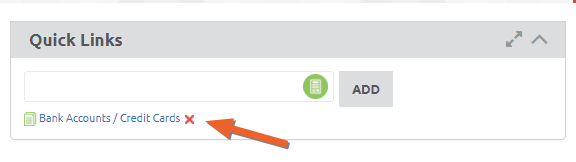
A third way to access commands is by creating a link to them in the Quick Links area. Setting up quick links uses the same type of search that the System Menu box does. In the example below, we have searched for the Bank Account/Credit Card screen that we have been using in our examples. Selecting this item and clicking the "Add" button will create a quick link that you can use to go directly there.
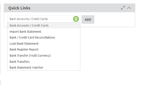
To remove the Quick Link, click the red X next to it.
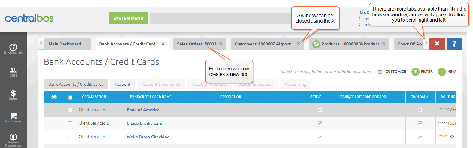
Multiple Windows
You may have noticed that when you open a window, it becomes an additional choice on the screen, rather than replacing the old one. You can have many windows open at the same time. When more window tabs are displayed than fit on the screen, arrows will appear to allow you to scroll through the various window tabs. To close a window, use the X.